東京都内までの通勤の苦労を控えるため、便利な場所を見つけるスクリプトです。
まず、このサイト(https://ensenmin.com/first)による候補者を取ります。
候補者の中に重複の駅名をまず取り出します。
そして、Pythonのseleniumモジュールを利用し、ブラザーの行動を模擬します。
Yahoo乗換案内(https://transit.yahoo.co.jp/)のソースを見ながら、regexで情報を特定します。
取り出したい情報は始発駅、始発時間、到着時間、乗り換え数です。
時間コストはTimestampで差を計算し、Strに変更してDataFrameに次々と更新します。
最後にExcelで出力します。
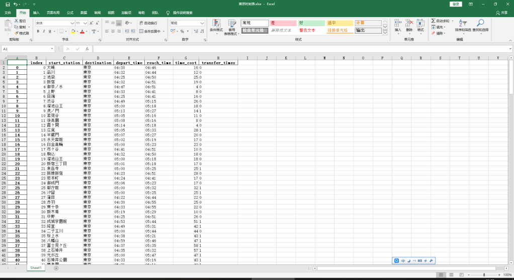
そして、新宿駅までの経由も調べて、並べれば、下記のようです。
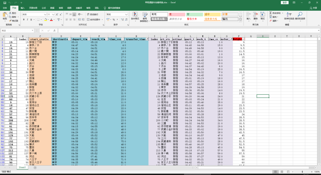
家賃も考えて、住みたいところは選べると思います。
コードは下記です。
# -*- coding: utf-8 -*
import urllib.request
import random
from urllib.request import urlopen
from bs4 import BeautifulSoup
import re
import math
import time
import datetime
import pandas as pd
import numpy as np
import requests
from selenium import webdriver
from selenium.webdriver.chrome.options import Options

STATION_RECOMMENDATION_LINK = 'https://ensenmin.com/first'  #
INFORMATION_DIC = {}
INFORMATION_DF = pd.DataFrame({'index': [], 'start_station': [], 'destination': [],
                               'depart_time': [], 'reach_time': [], 'time_cost': [], 'transfer_times': []}, index=None)
STATION_CANDIDATES = []
yahoo_link = 'https://transit.yahoo.co.jp/'


def look_up_route(depart_station, destination, index):
    chrome_driver = webdriver.Chrome(r'C:\Users\cdkag\Desktop\租房爬虫\chromedriver.exe')
    chrome_driver.get(yahoo_link)
    chrome_driver.find_element_by_id('sfrom').send_keys(depart_station)
    chrome_driver.find_element_by_id('sto').send_keys(destination)  # 到达站选择
    chrome_driver.find_element_by_id('air').click()
    chrome_driver.find_element_by_id('sexp').click()
    chrome_driver.find_element_by_id('exp').click()
    chrome_driver.find_element_by_id('hbus').click()
    chrome_driver.find_element_by_id('bus').click()
    chrome_driver.find_element_by_id('fer').click()  # 排除渡轮
    chrome_driver.find_element_by_id('tsFir').click()  # 始发选择
    chrome_driver.find_element_by_id('y').send_keys('2020')  # 时刻表年份
    chrome_driver.find_element_by_id('m').send_keys('3')  # 时刻表月份
    chrome_driver.find_element_by_id('d').send_keys('2')  # 时刻表天数
    chrome_driver.find_element_by_id('hh').send_keys('6')  # 时刻表小时
    chrome_driver.find_element_by_id('mm').send_keys('0')  # 时刻表分钟
    chrome_driver.find_element_by_class_name('optSort').find_element_by_tag_name('select').send_keys('乗り換え回数順')
    element = chrome_driver.find_element_by_id('searchModuleSubmit')  # 定位提交按钮
    element.submit()  # 提交页面
    # print('current_url:\n', chrome_driver.current_url)  # 读取当前页面地址
    new_page = BeautifulSoup(urlopen(chrome_driver.current_url).read(), 'html.parser')
    start_time_bs = new_page.find_all('li', {'class': 'time'})[1].get_text()
    depart_time = re.search(r'(\d){2}(\:)(\d){2}', start_time_bs).group()
    print('出发时间: ', depart_time)
    reach_time = new_page.find_all('li', {'class': 'time'})[1].get_text()
    reach_time = re.search(r'(\→)(\d){2}(\:)(\d){2}', reach_time).group()[1:]
    # reach_time = new_page.find_all('li', {'class': 'time'})[1].find('span', {'class': 'mark'}).get_text()
    print('到达时间: ', reach_time)
    start_time_cal = datetime.datetime.strptime(depart_time, '%H:%M')  # 获取最新日期表示为时间戳类型
    reach_time_cal = datetime.datetime.strptime(reach_time, '%H:%M')  # 获取最新日期表示为时间戳类型
    time_cost = str(re.search(r'(\d){1}(\:)(\d){2}', str(reach_time_cal - start_time_cal)).group())
    print(int(time_cost[:1]), int(time_cost[2:]))
    time_cost = int(time_cost[:1]) * 60 + int(time_cost[2:])
    print('耗时: ', time_cost, ' mins')
    transfer_times = re.search(r'(\d)+', new_page.find_all('li', {'class': 'transfer'})[0].find('span', {
        'class': 'mark'}).get_text()).group()
    print('换乘次数: ', transfer_times)
    INFORMATION_DF.loc[index] = [index, depart_station, destination,
                                 depart_time, reach_time, time_cost, transfer_times]
    INFORMATION_DF.to_excel('Yahoo时刻表.xlsx')
    chrome_driver.close()


if __name__ == '__main__':
    dic_candi = ['大崎', '品川', '池袋', '東京', '新宿', '御茶ノ水', '上野', '田端', '渋谷', '虎ノ門', '茗荷谷', '後楽園', '霞ヶ関', '広尾', '半蔵門', '水天宮前', '白金高輪', '市ヶ谷', '駒込', '溜池山王', '新宿三丁目', '泉岳寺', '新線新宿', '岩本町', '御成門', '都庁前', '汐留', '蒲田', '赤羽', '東十条', '新木場', '中野', '成城学園前', '経堂', '二子玉川', '桜上水', '八幡山', '富士見ヶ丘', '上石神井', '光が丘', '石神井公園', '豊島園', '成増', '上板橋', '竹ノ塚', '青砥', '高砂', '浅草', '荻窪', '中野富士見町', '中目黒', '北千住', '南千住', '八丁堀', '代々木上原', '綾瀬', '北綾瀬', '押上', '清澄白河', '東陽町', '京急蒲田', '住吉', '赤羽岩淵', '王子神谷', '小竹向原', '西馬込', '浅草橋', '大島', '笹塚', '西高島平', '高島平', '新板橋', '新御徒町', '東京テレポート', '高尾', '八王子', '豊田', '武蔵小金井', '立川', '青梅', '武蔵五日市', '奥多摩', '河辺', '三鷹', '町田', '稲城長沼', '西国立', '府中本町', '唐木田', '多摩センター', '高尾山口', '京王八王子', '高幡不動', '若葉台', 'つつじヶ丘', '府中', '北野', '吉祥寺', '清瀬', '保谷', '拝島', '玉川上水', '西武遊園地', '磯子', '鶴見', '東神奈川', '桜木町', '小机', '中山', '矢向', '長津田', '菊名', '横浜', '元町・中華街', '日吉', '金沢文庫', '神奈川新町', '川崎', '京急川崎', '登戸', '武蔵中原', '武蔵溝ノ口', '溝の口', '向ヶ丘遊園', '新百合ヶ丘', '鷺沼', '武蔵小杉', '元住吉', '久里浜', '逗子', '大船', '横須賀', '平塚', '小田原', '国府津', '藤沢', '二宮', '橋本', '茅ヶ崎', '本厚木', '新松田', '秦野', '伊勢原', '海老名', '相模大野', '相武台前', '片瀬江ノ島', '中央林間', '三崎口', '浦賀', '新逗子', '三浦海岸', '堀ノ内', 'かしわ台', '大和', '二俣川', '千葉', '幕張', '蘇我', '海浜幕張', '千葉中央', '津田沼', '西船橋', '君津', '上総一ノ宮', '佐倉', '成東', '成田', '成田空港', '木更津', '我孫子', '松戸', '柏', '新習志野', '上総湊', '勝浦', '南船橋', '京成臼井', '京成佐倉', '京成成田', '京成大和田', '宗吾参道', '東成田', 'ちはら台', '芝山千代田', '印旛日本医大', '印西牧の原', '妙典', '浦安', '東葉勝田台', '八千代緑が丘', '本八幡', '大宮', '南浦和', '武蔵浦和', '指扇', '浦和美園', '川越市', '本川越', '南古谷', '高麗川', '籠原', '深谷', '東所沢', '南越谷', '飯能', '小手指', '所沢', '狭山市', '小川町', '森林公園', '志木', '上福岡', '久喜', '東武動物公園', '北越谷', '北春日部', '南栗橋', '八潮', '鳩ケ谷', '和光市', '鹿島神宮', '古河', '取手', '土浦', '勝田', '水戸', '高萩', 'つくば', '守谷', '宇都宮', '小金井', '黒磯', '氏家', '高崎', '新前橋', '前橋', '館林', '熱海', '伊東', '沼津', '大月', '河口湖']
    START_LOG = 0
    df = pd.read_html(STATION_RECOMMENDATION_LINK)
    for i in range(1, len(df[-1])):
        phrase = re.split('、', df[-1][1].iloc[i])
        for j in range(len(phrase)):
            STATION_CANDIDATES.append(phrase[j])
    print(len(STATION_CANDIDATES))
    print(STATION_CANDIDATES)
    dic_candi.remove('東京')
    for each in range(len(dic_candi)):
        look_up_route(dic_candi[each], '東京', START_LOG)
        START_LOG = 1 + START_LOG
        time.sleep(1)